Color is a powerful tool in interior design. It has the ability to affect our emotions, set the mood, and even influence how we interact with a space. Whether you’re decorating your living room, bedroom, or home office, understanding the principles of color psychology in home decor can help you create a harmonious and inviting environment. In this blog post, we’ll explore 20 secrets of using color psychology to transform your home. These tips will guide you in choosing the right colors that not only look beautiful but also enhance the mood and energy of your space.
What is Color Psychology in Home Decor?
Before diving into the secrets, it’s important to understand the concept of color psychology in home decor. Color psychology is the study of how different colors affect our emotions, mood, and behavior. In the context of home decor, it means choosing colors that align with the atmosphere you want to create in your living space. Some colors can make a room feel calm and peaceful, while others can energize or motivate you. By applying color psychology, you can design a home that not only looks great but also makes you feel great.
1. Calm Your Space with Soft Blues
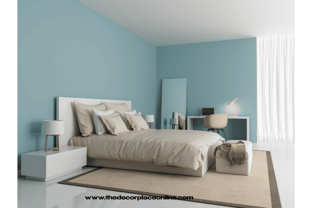
When it comes to creating a peaceful, calming environment, blue is one of the best colors you can choose. Color psychology in home decor shows that blue promotes relaxation and reduces stress. It is often associated with the sky and the ocean, which are natural elements that help us feel at ease. Light blue tones are perfect for bedrooms or living rooms where you want to unwind and relax after a long day. Blue can help create a serene atmosphere that encourages restful sleep and peaceful moments.
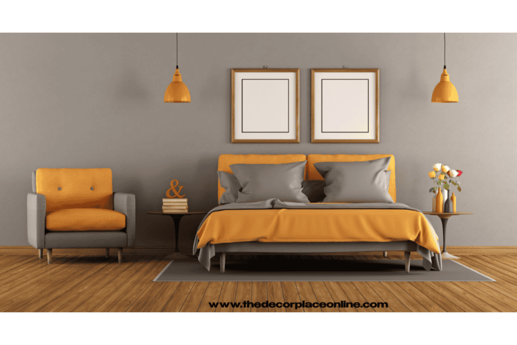
2. Create a Welcoming Atmosphere with Warm Colors
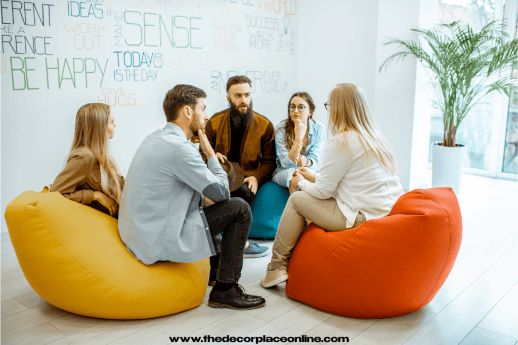
Warm colors like red, orange, and yellow can create a welcoming and energizing space. These colors are known for their ability to stimulate conversation and create an inviting environment. Color psychology in home decor suggests that red is particularly great for social spaces, such as the living room or dining room, as it fosters warmth and connection. Orange adds a playful, vibrant energy to a room, while yellow is cheerful and uplifting. When used thoughtfully, warm colors can make your home feel more alive and vibrant.
3. Add Sophistication with Neutrals
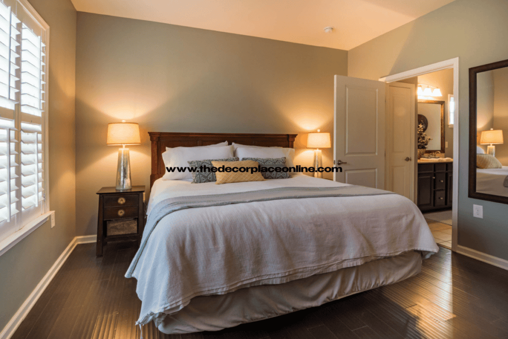
Neutral colors like beige, gray, and white are timeless and versatile. Color psychology in home decor shows that these colors create a balanced, peaceful space that can work in any room of your home. Neutrals provide a perfect backdrop for accent colors and allow other elements of your decor, like furniture and artwork, to shine. They also make small spaces feel larger and more open. By using neutral tones, you can create a sophisticated and calming environment that is easy to pair with any style.
4. Bring Nature Indoors with Green
Green is a color that is deeply connected with nature and renewal. It symbolizes growth, harmony, and balance. Color psychology in home decor highlights the fact that green is one of the most relaxing colors, making it ideal for spaces like bedrooms and living rooms. Whether you choose soft sage, mint, or vibrant emerald, green can help create a calming atmosphere that promotes rest and rejuvenation. It’s also known to improve concentration, making it a great choice for home offices or study areas.
5. Energize Your Space with Yellow
If you want to infuse energy and optimism into your home, yellow is the color to go for. Color psychology in home decor reveals that yellow is associated with happiness, positivity, and creativity. This bright and cheerful color is perfect for kitchens, dining areas, or entryways where you want to create an inviting atmosphere. Just be careful not to overuse yellow, as too much can cause feelings of frustration or anxiety. Instead, use yellow in small doses, such as throw pillows, artwork, or accessories.
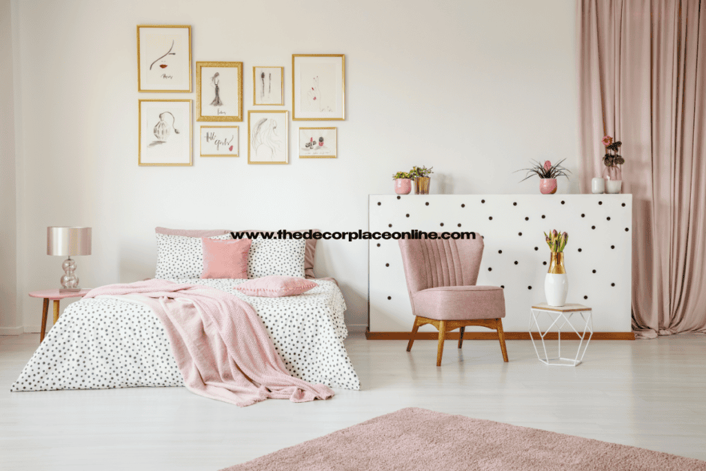
6. Create an Inviting Bedroom with Soft Pink
For a soft and romantic atmosphere, consider incorporating pink into your bedroom decor. Color psychology in home decor suggests that pink is a color associated with love, warmth, and comfort. Light pink tones can evoke feelings of tenderness and calm, making them perfect for creating a relaxing bedroom retreat. Pair pink with neutral tones like beige or gray for a balanced and soothing effect.
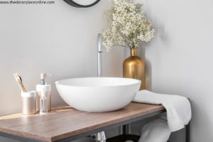
7. Maximize Small Spaces with White
White is a classic and clean color that can make small spaces feel more open and airy. Color psychology in home decor indicates that white has the ability to reflect light, making rooms feel brighter and more spacious. This makes it a great choice for apartments or smaller homes where space is limited. White also promotes clarity and simplicity, giving your home a fresh and minimalist feel.
8. Set a Calm Mood with Lavender
Lavender is a blend of purple and white, and it is often associated with relaxation and healing. Color psychology in home decor shows that lavender can help reduce stress and promote a peaceful, calm environment. It’s perfect for bedrooms or any space where you want to unwind and recharge. Lavender also works well as an accent color, adding a touch of softness and elegance to your home.
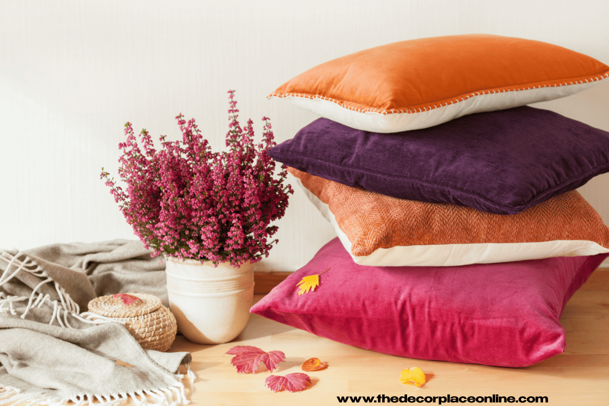
9. Add Warmth with Terracotta
If you’re looking for a color that adds warmth and depth to your space, terracotta is a fantastic option. Color psychology in home decor tells us that terracotta is an earthy color that evokes feelings of warmth, stability, and comfort. It’s ideal for creating a cozy living room or dining room where you can relax and entertain guests. Terracotta pairs beautifully with neutrals and other warm tones, creating a balanced and inviting atmosphere.
10. Stimulate Creativity with Orange
Orange is a color that stimulates creativity, enthusiasm, and energy. Color psychology in home decor shows that orange is great for home offices, studios, or any space where you want to feel motivated and inspired. It’s a lively and cheerful color that can also help improve focus and productivity. However, since it is quite a bold color, it’s best to use it sparingly as an accent, such as in pillows, rugs, or small accessories.
11. Use Metallics for Luxury
Metallic colors like gold, silver, and copper are often used to add a touch of luxury and elegance to a space. Color psychology in home decor reveals that metallics are associated with wealth, sophistication, and prestige. They can be used to create a glamorous, high-end feel in any room of your home. You can add metallic accents through furniture, light fixtures, or decor items like vases and picture frames.
12. Calm Anxiety with Light Gray
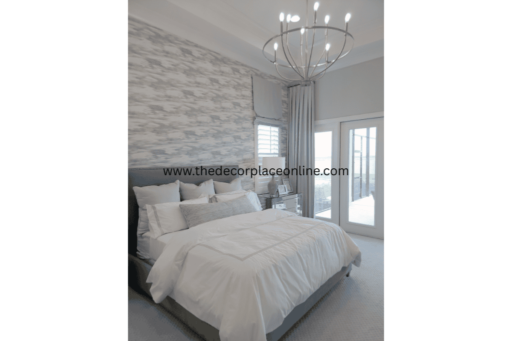
Light gray is a soothing and neutral color that can help create a calm and peaceful environment. Color psychology in home decor suggests that gray is a versatile color that works well in any room, particularly in spaces where you want to reduce stress and anxiety. Light gray walls or furniture can provide a soft backdrop that allows other colors to pop, creating a balanced and harmonious room.
13. Create Balance with Brown
Brown is an earthy, grounding color that promotes stability and comfort. Color psychology in home decor shows that brown is a color associated with security and reliability. It’s ideal for living rooms, libraries, or home offices where you want to create a stable and welcoming environment. Brown pairs well with neutral colors and natural materials like wood and leather, helping to create a warm and inviting atmosphere.
14. Use Blue to Increase Focus
Blue is not only calming, but it also helps increase focus and concentration. Color psychology in home decor suggests that blue is an excellent choice for home offices, study areas, or any space where you need to stay focused and productive. Light blues are relaxing, while darker blues promote clarity and mental sharpness. You can use blue in your decor to create an environment conducive to work or study.
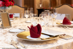
15. Invigorate Your Dining Room with Red
Red is a color known for its ability to stimulate appetite and create excitement. Color psychology in home decor suggests that red is ideal for dining rooms or kitchens, as it encourages social interaction and makes meals feel more special. Red is also a bold color, so it’s best used in moderation. A red accent wall or red decor items like chairs or table settings can add just the right amount of energy to your space.
16. Use Green to Boost Productivity
As mentioned earlier, green is a calming color, but it also plays a role in improving productivity. Color psychology in home decor tells us that green helps with focus, balance, and creativity. It is an excellent color choice for your home office or study area. Whether you choose a subtle sage green or a deep forest green, incorporating this color into your workspace will enhance your productivity.
17. Enhance Your Living Room with Coral
Coral is a warm, vibrant color that adds life to any room. Color psychology in home decor suggests that coral is perfect for living rooms or other spaces where you want to create a lively, energetic environment. It’s a combination of pink and orange, making it both inviting and energizing. Coral can be used as an accent color in pillows, rugs, or wall art to brighten up your space.
18. Create a Cozy Reading Nook with Beige
Beige is a warm, neutral color that creates a cozy and inviting space. Color psychology in home decor shows that beige promotes relaxation and comfort. It’s the perfect color for a reading nook or a space where you want to unwind and enjoy some quiet time. Beige also pairs well with other warm tones like terracotta or brown, allowing you to create a harmonious and peaceful environment.
19. Incorporate Black for Elegance
While black is often seen as a bold and dramatic color, it can also add elegance and sophistication to your home. Color psychology in home decor reveals that black represents power and authority. When used in moderation, black can add depth and luxury to a room. Consider using black for furniture, light fixtures, or decorative accents to give your space a timeless, elegant feel.
20. Brighten Your Space with Light Yellow
If you want to add brightness to a room without using bold yellow, light yellow is the way to go. Color psychology in home decor suggests that light yellow promotes happiness and positivity without being overwhelming. It’s a perfect color for kitchens, bathrooms, or entryways where you want to create a bright, welcoming atmosphere.
Final Thoughts on Color Psychology in Home Decor
By incorporating color psychology in home decor, you can create a space that not only looks great but also makes you feel great. Whether you’re aiming for relaxation, energy, or creativity, the colors you choose can help shape the mood and atmosphere of your home. Remember, color is a powerful tool that can enhance your well-being and elevate the overall feel of your space. So, start experimenting with colors and enjoy the transformation that color psychology can bring to your home.